

Today I’m excited to introduce Krishma Shah Dashboard experience for any new learners into Tableau to design beautiful dashboard within Tableau.
Thanks to her for sharing it in an detailed format!
I really enjoy learning the beauty of Canva + Tableau = Beauty with cool visualization of Bar Chart.
Krishma Shah design Experience is shared below by herself >>
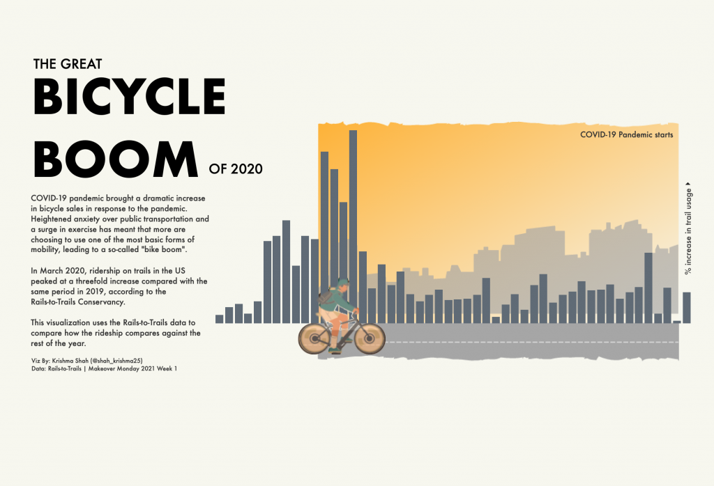
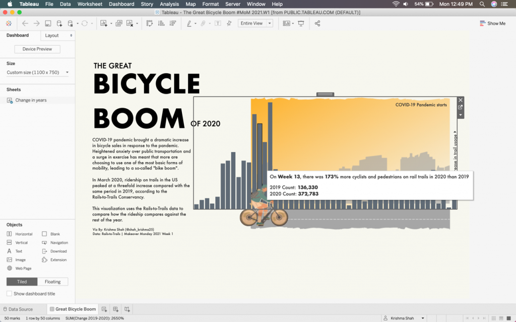
Last week I made a simple (yet a little complex) visualization in Tableau for the first week of Makeover Monday for the year 2021 about the great bicycle boom in 2020. If you want to know how I made this viz, then keep reading and follow with me as I uncover it. The final data visualization is shown below and you can explore the interactive dashboard on my Tableau Public profile here.
Believe it or not, this is the first time I’ve written a dataviz blog or in fact, any blog for that matter. I’m very much grateful to Rajavel S for letting me have this opportunity to be a guest author for his blogs and I hope anyone reading this can get a little inspired and that would mean I did my job here!
Data Understanding
I started with looking at the dataset from data.world/makeovermonday and the concept was pretty concise and clear. Just to clarify, the Tableau community releases data very week and its pretty easy to download and start with the analysis.
Dashboard Design
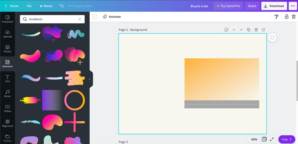
I was thinking to make a minimalistic design background for this one. I had a sunset background with a bicycle in mind to depict the topic and have bar charts to look like the city building structures. Without any doubt, I headed to my favorite platform Canva to make the background. Canva is a free online design tool use to create social media graphics, presentations, posters, documents and other visual content.

The colors are chosen from the logo mentioned in the article. First, I started with new design with a custom size (of 1100 px X 750 px) same as my dashboard size, gave background color of #F7F7EF.
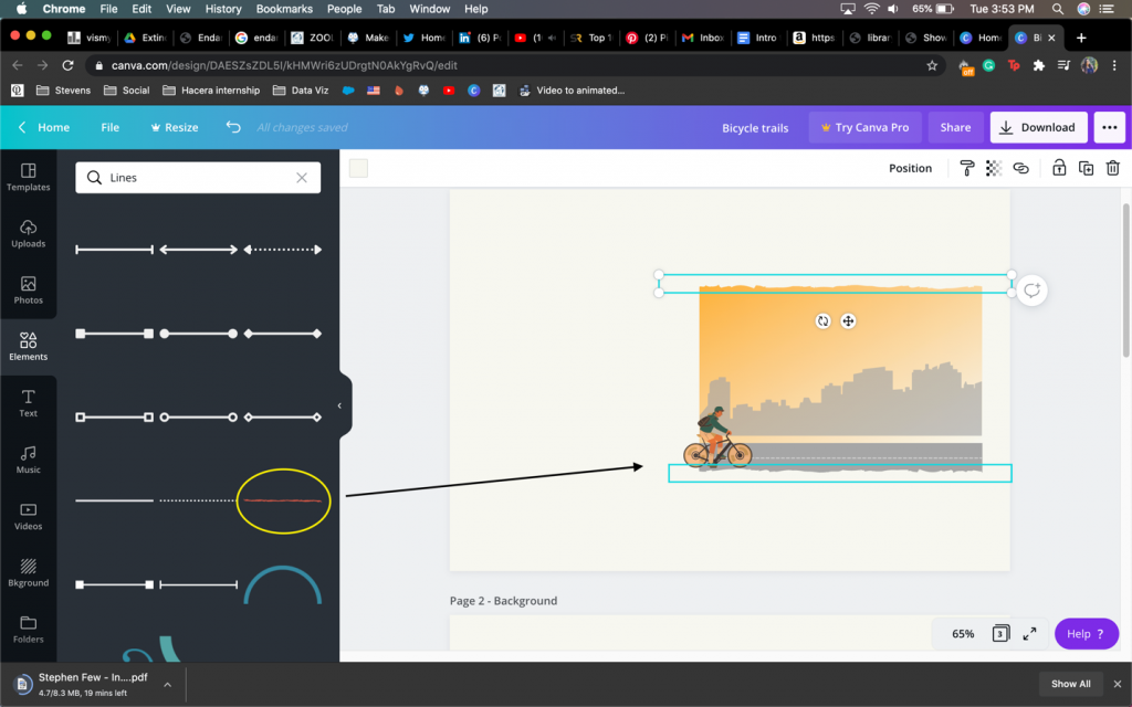
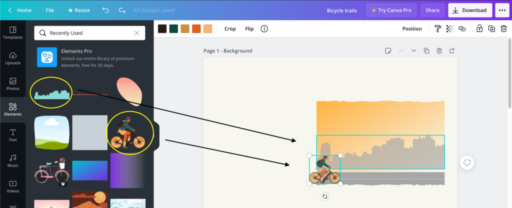
Then, I started with a simple rectangle gradient object and choose the two shades of yellow from the color scheme (#F7F7EF, #F9B239) to depict the sunset. Then I added the silhouette of the buildings (template from the elements in Canva) with a low transparency as 65%. Added another rectangle shape with dark grey to show the road.
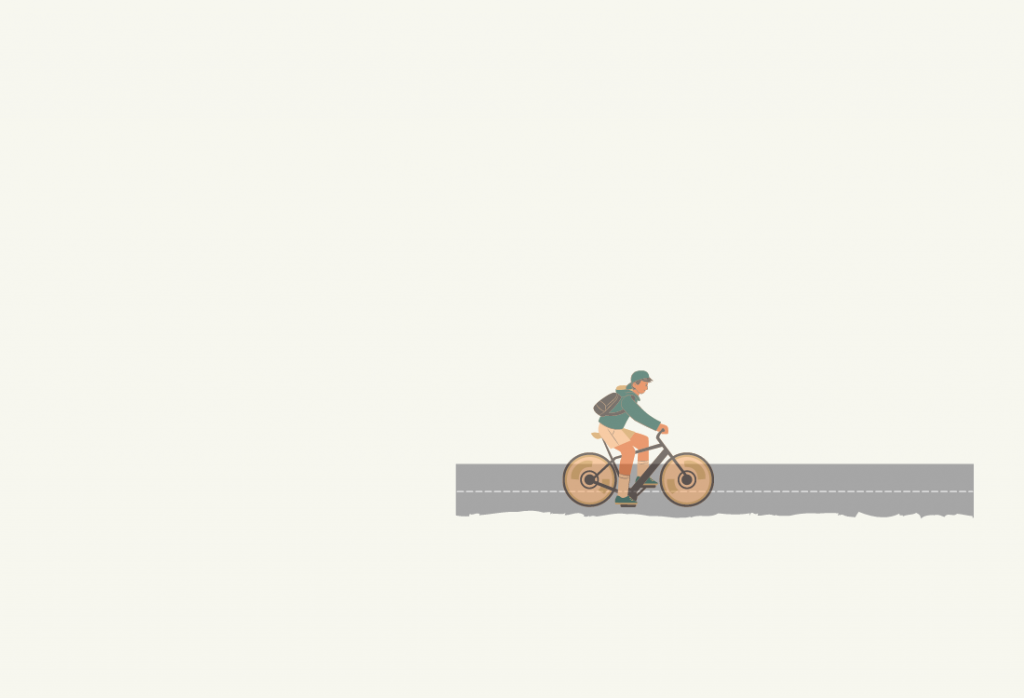
Canva lets you add elements in your design, in this case, as the boy on the bicycle. I edited some of the elements as the shirt color to green, bicycle to yellow to match the color scheme of the logo.
I cropped the bicycle image from Canva and in order to make it a .png image, I headed over to our very own MS PowerPoint! To make the transparent background and have the image as an icon, I used the ‘Picture Format’ tool in PowerPoint to achieve it as seen below.
From this:
To this:

To do this, I used a tutorial by Kevin Stratvert on ‘How to remove background from picture’ in PowerPoint. If you want to do the same, here’s the link that explains the process. Also, I had the transparency set to almost 50% for the image, since I wanted the charts to be the highlight and kind of see-through from the icon. You’ll get to know what I’m talking in just a while.
Adding layers in Tableau
Now that I have all the elements ready, I switched to Tableau to incorporate the whole dashboard. I used the layering technique that I learned from Judit Bekker’s blog. You can find a link to the article here. Thank you, Judit for the blogs! I’m forever grateful to you for helping me learn so much.
After making the charts, the next step was to add it to the dashboard.
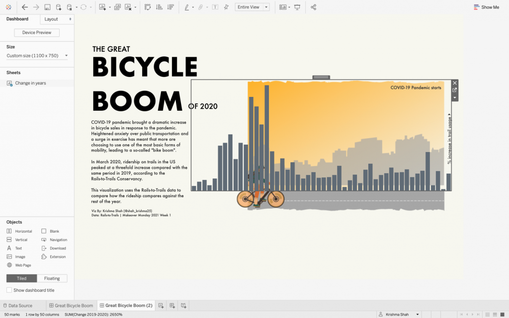
Adding the text with font ‘Futura’ (one of my favorites) and the bar chart with proper alignment with the image, the only thing left was to add the bicycle to complete the dashboard. I aligned the bicycle image with co-ordinates (x, y, w, h) shown below to match the background.
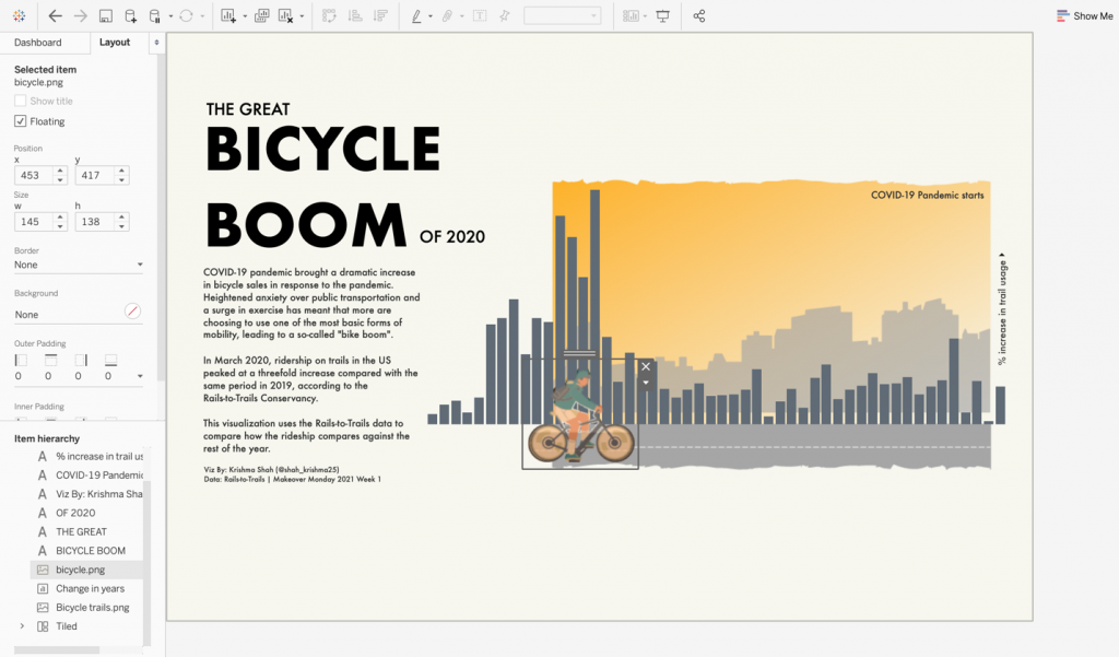
The only thing left was to duplicate the original bar chart with 0% opacity that I placed on top with the same co-ordinates as the bar chart to allow the tooltips to be visible.
I hope this helps for anyone looking to add layers and make their dashboards pop within the Tableau community and got a sneak peek at behind the scenes! I can’t wait to see what more people create and would love the feedback. I am very active on Twitter (@shah_krishma25) and LinkedIn. Please feel free to connect and I’ll happily help!
Thank you for reading till the end. Keep Learning!!
Thanks a lot for such a beautiful insight. it really helps for people like us to learn the minute details of the vizzing skill.