As promised, sharing my debut IronViz experience with Tableau today.
What is IronViz?
Iron Viz—the world’s largest virtual data visualization competition—ignites and showcases the power of the Tableau Community, giving you the opportunity to interact with data rock stars worldwide. Three finalists (determined by the Iron Viz Qualifier Contest earlier this year) will advance to the Iron Viz Championship this October.
Every year Tableau organizes it & this time it was virtual, more participants and more tougher contests. I didn’t WIN but learnt a lot throughout the process.
Really Happy for folks who are into top 10 finalists selections! Also very much happy that “Sue Grist” who also analyzed “Organ Transplants” topic which is in line to my thought process of sharing my message to the community.
MY JOURNEY of IRONVIZ DESIGN PROCESS
Inspiration
My inspiration of this topic was after watching “Breathe” series by Madhavan. It clearly shows the pain an Organ Receiver is going through and what all it made them to do to the community due to it. Key problem is “WAITING LIST” for the organ for longer time.
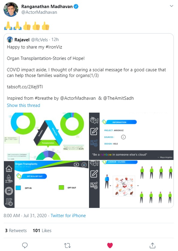
I was really happy that, my social message Viz which was inspired after watching “Breathe” series – Actor Madhavan (Called as Maddy) in Indian Cinema – he tweeted my post & gave pure happiness that message is being shared to more audience through him! He is an true inspiration.
Requirement Study
Once i decided the topic, i started performing research study on Organ Donation & got good amount of information for USA country(as that’s the data was easily able to get and share with folks – rest of the country data was minimal to focus detailed).
Here are some of my notes before i started my development :
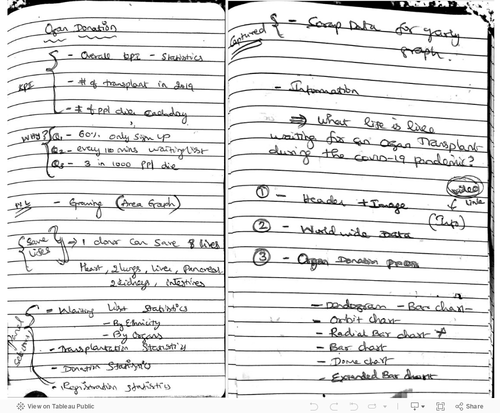
As i started with above notes and gathering lot of excel data for my analysis – I was going through the story telling process in my mind to explain it nicely for all the users to understand about the Organ Donation issues and how it impacts during COVID-19 as well.
Tons of references have to go through in getting the story worked out for my IronViz
https://optn.transplant.hrsa.gov/data/
https://donatelifecalifornia.org/wp-content/uploads/2013/12/The-Organ-Donation-Process.pdf
https://www.organdonor.gov/statistics-stories/statistics.html
https://optn.transplant.hrsa.gov/
https://en.wikipedia.org/wiki/Organ_donation
https://en.wikipedia.org/wiki/Organ_donation_in_India
https://www.dcha.org/blogs/jennifer-hirt/2020/01/15/one-organ-donor-can-save-up-to-eight-lives
https://optn.transplant.hrsa.gov/data/
https://www.netclipart.com/isee/mhxRRJ_donation-clipart-hand-heart-hand-give-clipart-png/
https://deszone.net/download/1349/
https://unos.org/wp-content/uploads/unos/how_transplant_system_works_visual_journey.pdf
https://optn.transplant.hrsa.gov/learn/about-transplantation/history/
Design Flow & Iterations
You can see below how I have to go through various iterations to reach my final Viz
>> Iteration # 01

>> Iteration #02

>> Iteration #03
I was reaching #Datafam at this time for feedbacks to add long form background nice and clear – @Lindsay was helping me

I wasn’t happy with look and feel at this stage. So I had to reach an UI/UX expert assistance to make the Viz look better.
Muthu from UIshaper – helped me with Figma/Illustrator ideas. So I collaborated with him to get the best UI/UX styles & started getting to know the benefits of Figma. Thanks to Muthu for sharing lot of key insights in building this an better viz from UI perspective.
If you have come till here – then you should be interested to see how I have built some of the viz which turned out an better #IronViz submission personally to me for an DEBUT attempt.
Design Process
Chart 01 : Donut/ Ring Pie Chart

Chart 02 : Orbit Chart
Toan Hoang – Tableau Zen Master has an beautiful video explaining how to build this chart – hope it helps!
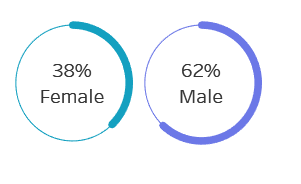
Chart 03 : Rounded Edge Bar chart
Thanks to Andy Kriebel (Tableau Zen Master)for this tip of creating this chart – it helped me to visualize my KPI’s in that format.
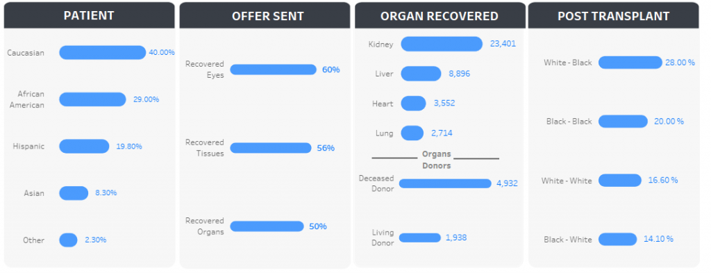
Chart 04 : Time Line Chart
Many have asked how did I implement this – I didn’t want to use formula’s to achieve it – as I got them created as image file & embed worksheets on top of it for each year filtered.
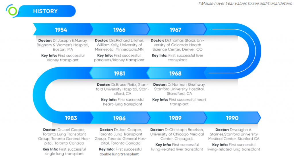
Example below : Year Worksheet placed on top of the image (not an best practice I would think)


If you’re really interested to achieve the above visualization, then Flerlage Twins (Tableau Zen Masters) have an wonderful blog posts detailing out with steps
URL : https://www.flerlagetwins.com/2018/07/curvy-timelines.html
Chart 05 : Gradient Bar Chart
Again I had to use “Toan Hoang – Tableau Zen Master” blog post to achieve it.

Chart 06 : Process Chart with Tooltip
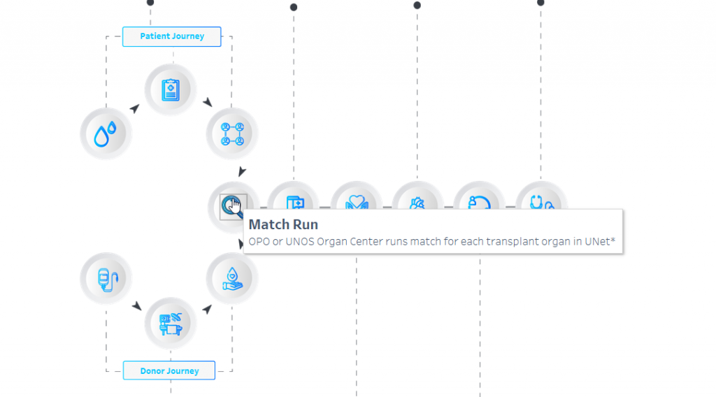
For above same concept as using worksheet to overlay on top of image – have these icons stored under “Shapes” folder in your local machine and then add it into worksheet + bring them on top of image overlaid. lot of formatting definitely to make it look good and clean finish.


So each process icon is individual sheet to overlay on top of the whole process image.
Chart 07 : USA Map
I have shared this earlier as an tip shared by Adi Mac – Thanks to her for giving feedbacks to make the maps look super cool than normal
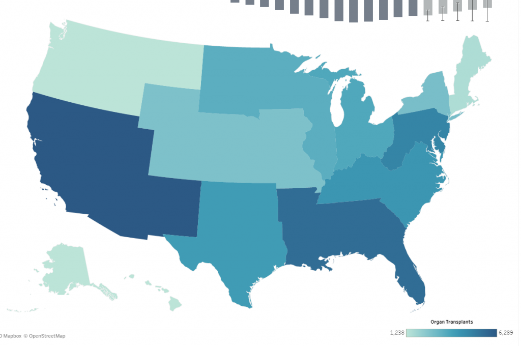

URL : Dirty Reprojectors
For USA MAP – used below
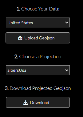
For World Map – Used below

A.D. Mac – gave me her beautiful tips on improving the IronViz Maps – Thanks to her offering the help to community with maps ! It was very helpful and learning for me to try out new in Tableau.
Tips Learnt In this Journey
Adam Mico Tip
It was Adam Mico – who shared “AD Mac” post of helping the community & He was the one who helped in moving me in thought process of Mobile design
Lorna Brown Tip
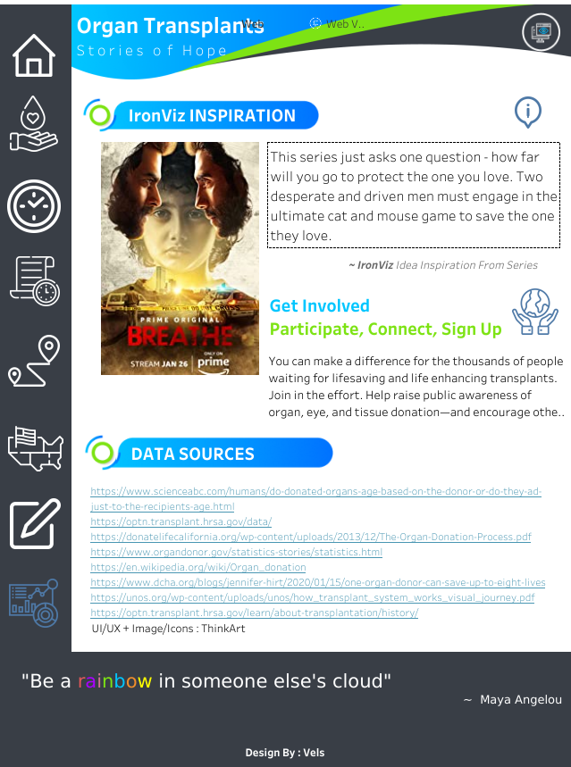
So after all the above learning, here is the final IronViz Debutant dashboard of mine in Tableau – Hope you enjoy it!
<script type='text/javascript'> var divElement = document.getElementById('viz1600657277926'); var vizElement = divElement.getElementsByTagName('object')[0]; if ( divElement.offsetWidth > 800 ) { vizElement.style.width='1000px';vizElement.style.height='827px';} else if ( divElement.offsetWidth > 500 ) { vizElement.style.width='1000px';vizElement.style.height='827px';} else { vizElement.style.width='100%';vizElement.style.height='727px';} var scriptElement = document.createElement('script'); scriptElement.src = 'https://public.tableau.com/javascripts/api/viz_v1.js'; vizElement.parentNode.insertBefore(scriptElement, vizElement); </script>
<script type='text/javascript'> var divElement = document.getElementById('viz1600626646223'); var vizElement = divElement.getElementsByTagName('object')[0]; vizElement.style.width='1220px';vizElement.style.height='8027px'; var scriptElement = document.createElement('script'); scriptElement.src = 'https://public.tableau.com/javascripts/api/viz_v1.js'; vizElement.parentNode.insertBefore(scriptElement, vizElement); </script>After finishing the IronViz Web Dashboard, I felt why don’t I create an Mobile view with Icons or Navigation buttons – so had to work on mobile Viz
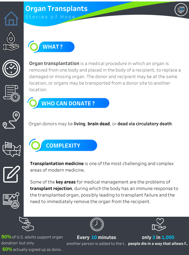

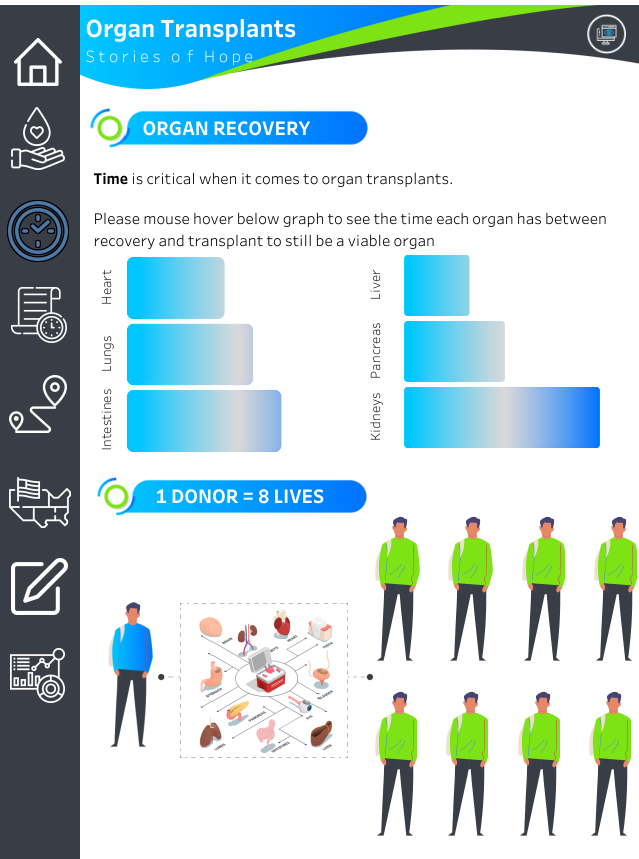
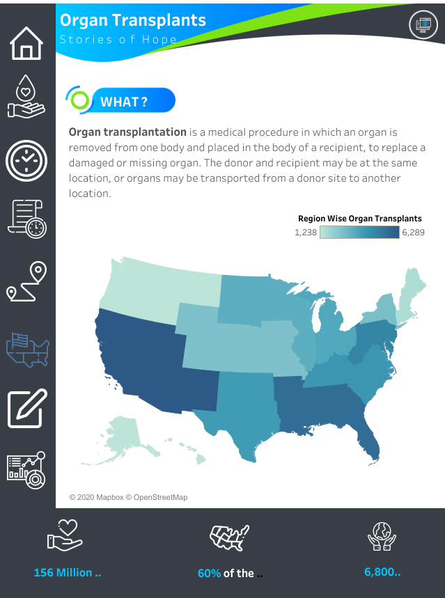
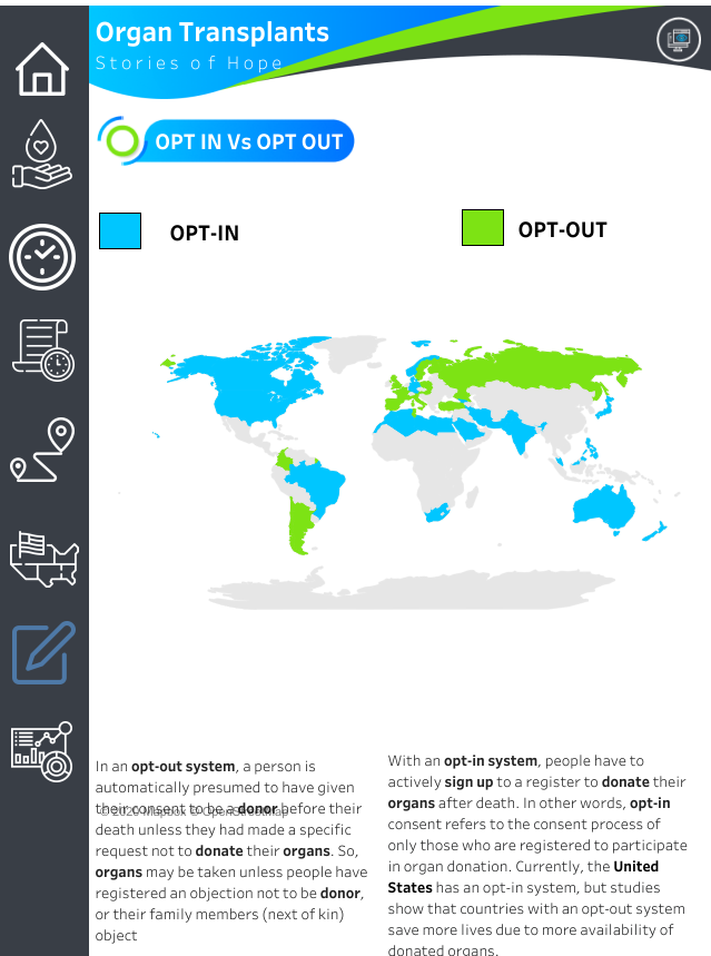
Congratulations to Christian Felix for IronViz 2020 Winner & Other contestants. It was true inspirational all the contestants Viz.
If missed to watch LIVE – do check below link — Its truly amazing to watch all 3 top finalists effort in designing the viz in 20 minutes.
https://tc20.tableau.com/episodes/iron-viz-309
If still you want to know more about IronViz – do check out below blog posts – hope it inspires you to join in 2021!
Here are few blogs to share for reference if still have any doubts 🙂
Reasons to enter IronViz by Sarah
Get Your IronViz Story straight by Josh
Enjoy your day! Hope you all are staying safe and healthy! Take Care!!

