I know, this is an late post of sharing the beautiful dashboard story telling by Ramkumar Venkatasubbu
I should say, this is purely great design by Ram in covering the story of valentine’s day spending across the globe.
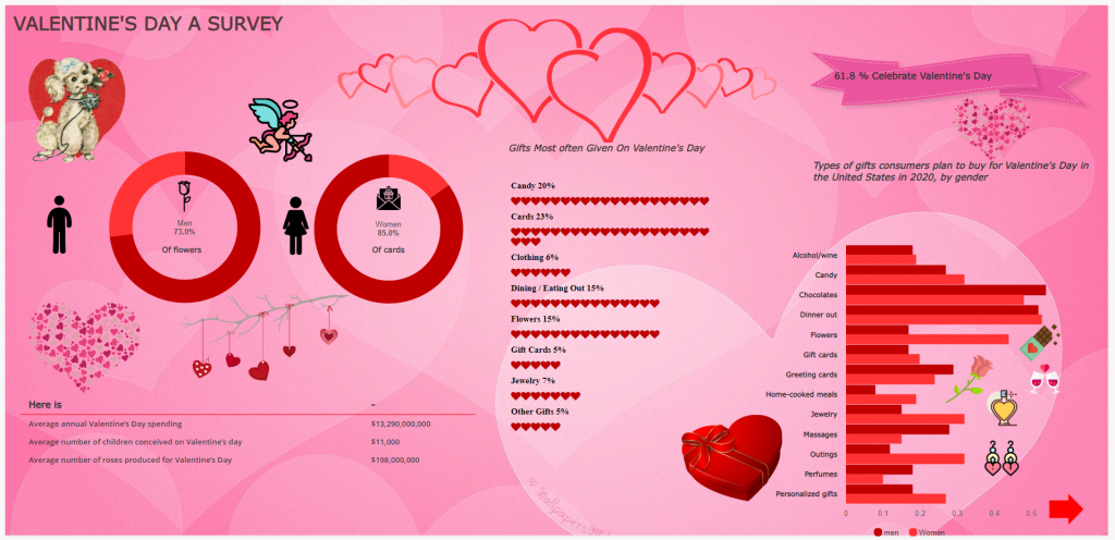
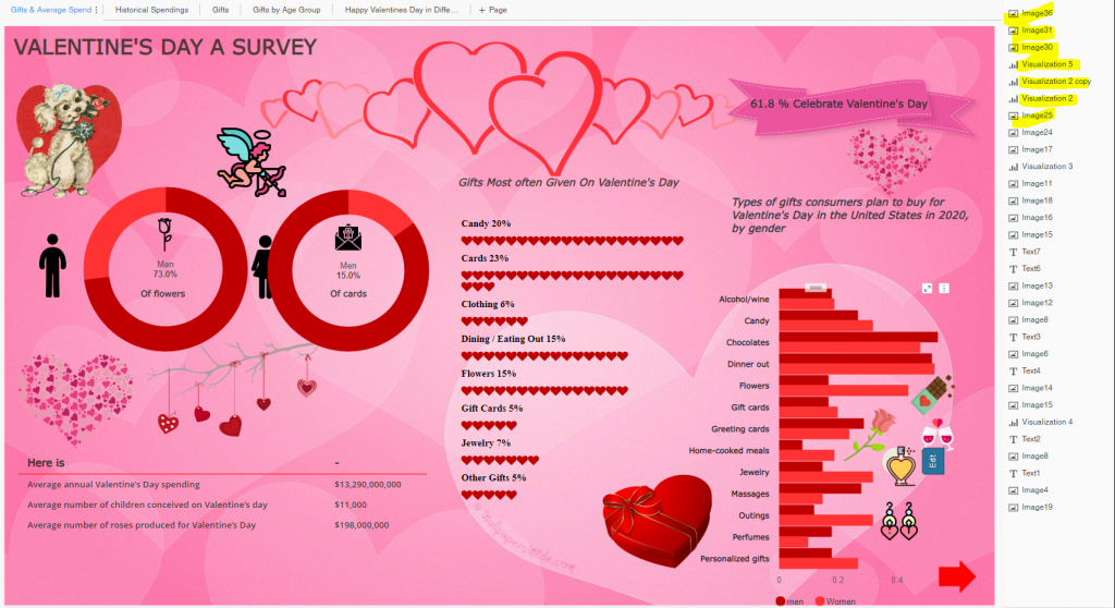
Below page clearly shows, 73% on buying “Flowers” by Men spent for their lovable person in life & 85% on getting Valentine card by Women for their loved one’s.
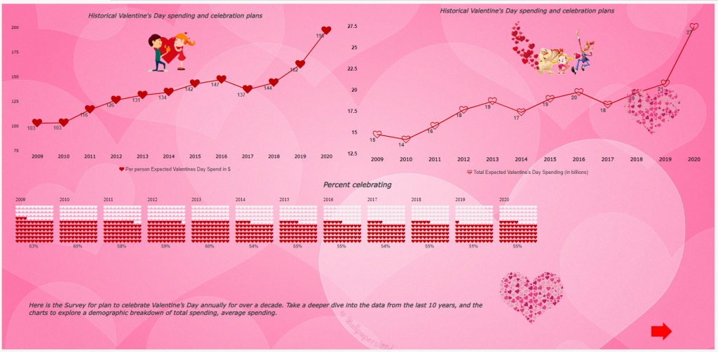
It clearly shows spending is increased every year for Valentine’s celebrations
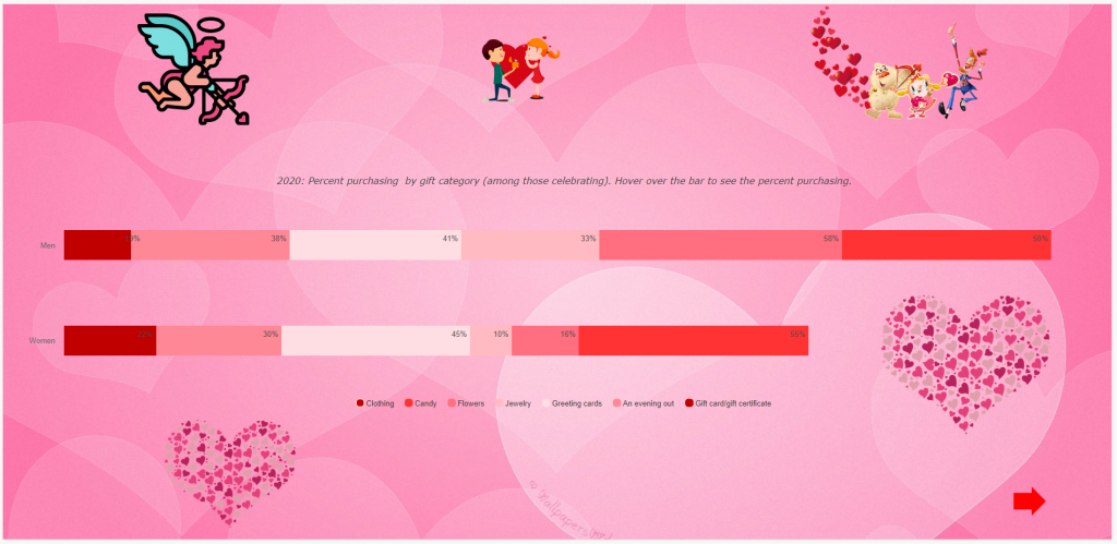
Below page shows, Men’s spent 58% on buying Flowers, while Women’s spent 55% on Candy
No doubt – Teens are spending more during Valentine’s Day

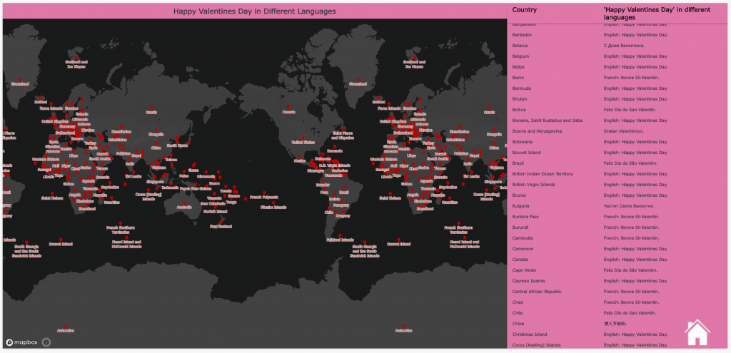
Last but not the least, “Happy Valentine’s Day” in different language – Nice representation! It would have been nice to put “I Love you” in different language 😉 – here is one from my knowledge – “Ich Liebe Dich” – German way of saying “I Love You“.
Tips from this dashboard to learn :
- Excellent use of Vitara charts (Free for Desktop/Workstation product – thin client – Isn’t it great to do self service analysis for free with lot of beautiful viz ? Enjoy using it !! Vitara
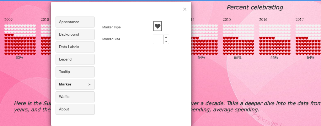
- Markers label with different symbols – easy to setup with Vitara charts
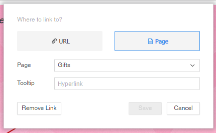
- Edit Links to next page – easy navigation’s
- Nice use of “Freeform Canvas” design & layering



Once again – Thanks to Ram for this excellent dashboard design!!
My recommendation would be to follow layering for good export and being responsive on different screen size.
Will write an article about it very soon!
Enjoy Reading!!


Hi Ram,
Nice Dossier 🙂 (y)
I can see you have used some rose image on Mapbox (Geospatial Map). How you have used that?
Could you please help me understand the same?
Thanks,
Amit