
Today thought of sharing some of the tips and tricks used on MicroStrategy Dossier that was built together by Rajavel & Myself for CGDV Data Challenge & DossBoss MicroStrategy Challenge.
CGDV – Center for Global Data Visualization
What is CGDV and how can you get involved?
The Center for Global Data Visualization (CGDV) is an initiative led by QED Group to build data visualization capacity and strengthen a culture of data use.
CGDV provides a unique platform for collaboration, offering opportunities for training, networking, publishing and professional development in data analytics and visualization. CGDV aims to mobilize the power of crowdsourcing to offer insights into some of the greatest challenges facing many low- and middle-income countries today.
https://www.centerforglobaldata.org/
Contest #1 Details : https://cgdv.github.io/challenges/COVID-19/
Contest #2 Details : https://www.microstrategy.com/us/go/dossboss
- CGDV Challenge : We were awarded as honorable mentions with 100$ winning prize..
- May DossBoss Challenge : We were selected as WINNER along with other contestants
I know, everyone is going through this pandemic on COVID-19 – so CGDV conducted an data analysis contest to help take some decisive actions or share some awareness about this pandemic globally.
Coming to MicroStrategy Dossier – we created story with our dashboard
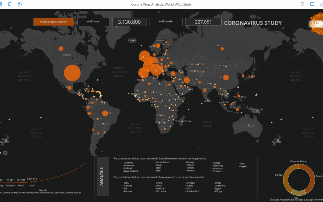
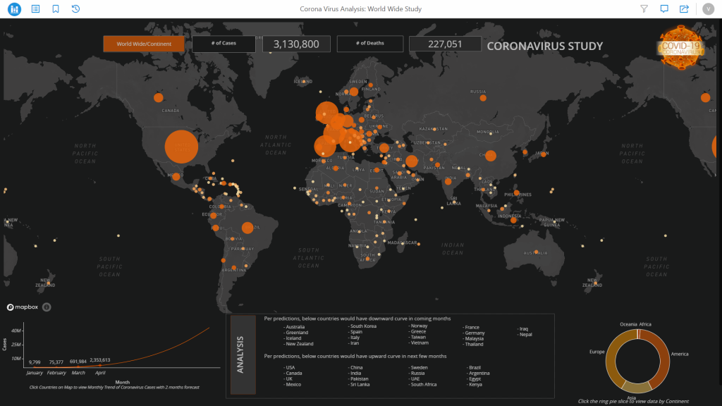
- Summary Global COVID-19 Cases/Deaths counts with predictions
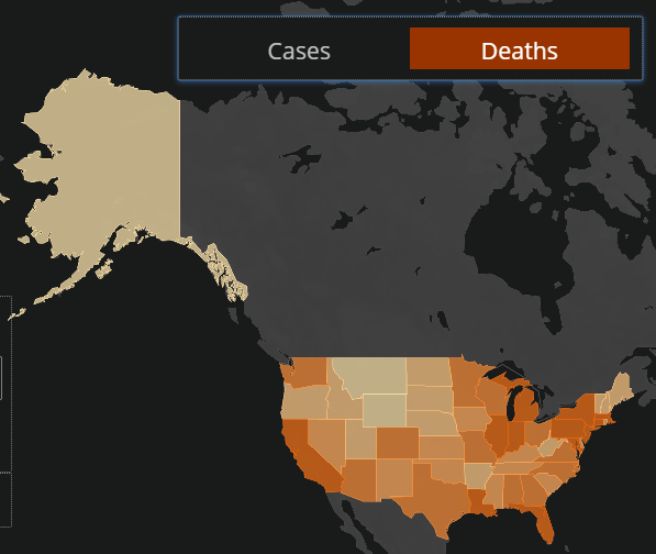
- USA Study of COVID-19
- USA Health Study
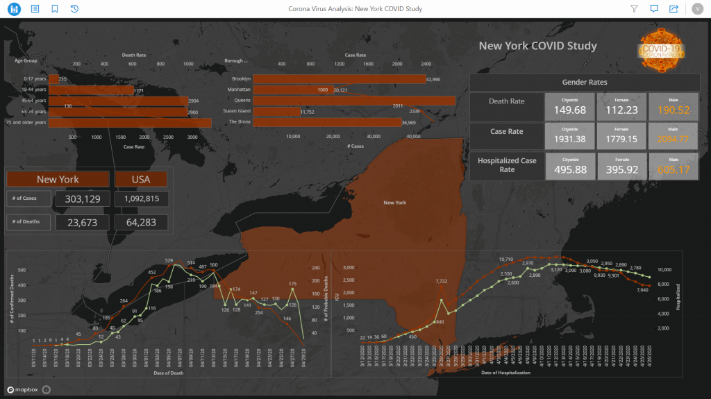
- New York COVID-19 Study
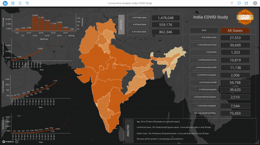
- India COVID-19 Study
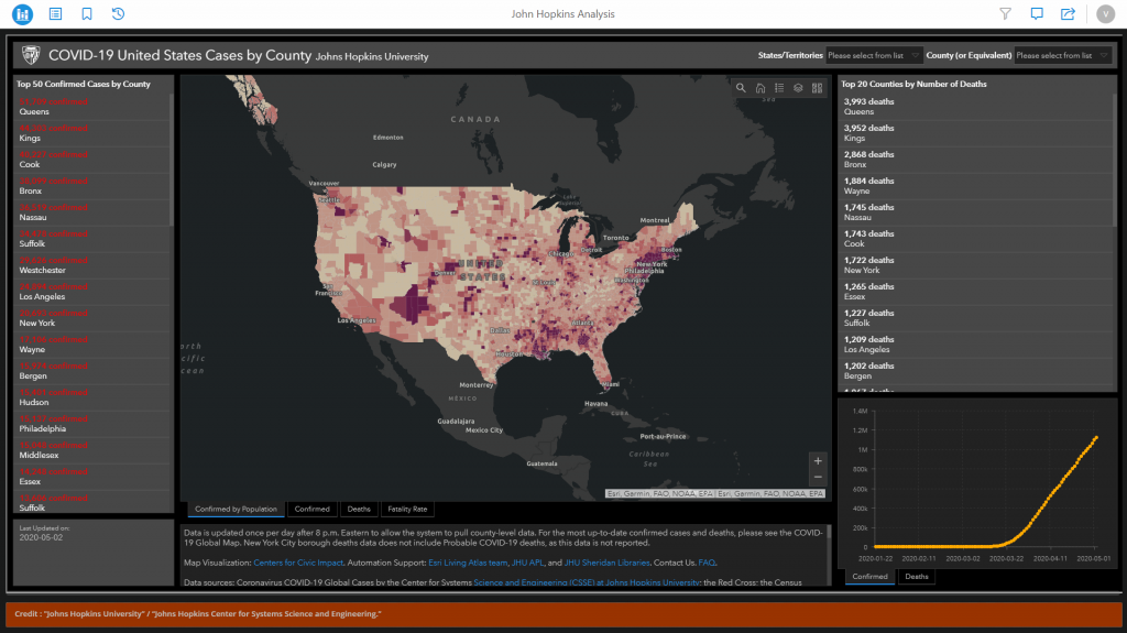
- Live Dashboard From John’s Hopkins University
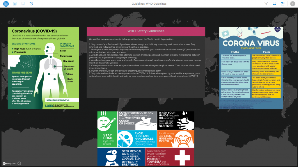
- WHO Site Embed with useful contents


Features Used:
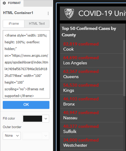
- HTML Container – Embed Website

- Grouping/Layering with Text Boxes

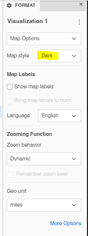
- Map Box Visualization – Dark Theme
- Dynamic Text Box (Posted by Vels here)
- Forecasting (Easy Setup with MicroStrategy)

- Metric Selector
Happy to share these experience together!
Download Dossier from Google Drive
If interested to view COVID-19 Data as of 3rd June, 2020 – check out this PDF
Enjoy Learning!! Stay Safe & Healthy!!
Well done Reema
Great Work Reema