

Here are the 5 Simple Guide for better visualization from my experience
- Be Consistent
- Better Spacing
- Tips for Alignment
- Better use of Bookmarks
- Use of Custom Charts
Be Consistent
A consistent dashboard always makes a better data interpretation. It is not only visually appealing but helps to make an easy connection with the visualization.
- Have consistent color theme across the dashboard
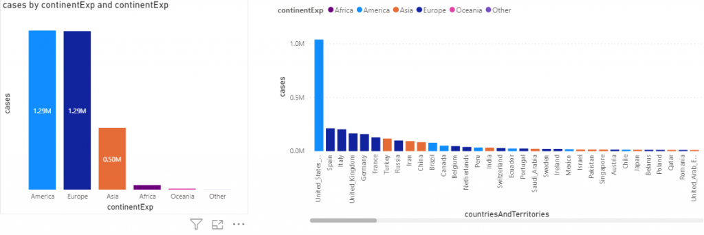
For e.g. : Power BI is smart enough to detect/identify the color. In below Viz you will see that each country has the same color coding as it continents.
- Use Consistent Fonts & Font colors across the visualizations.
- Use minimal color coding where ever possible.
Space
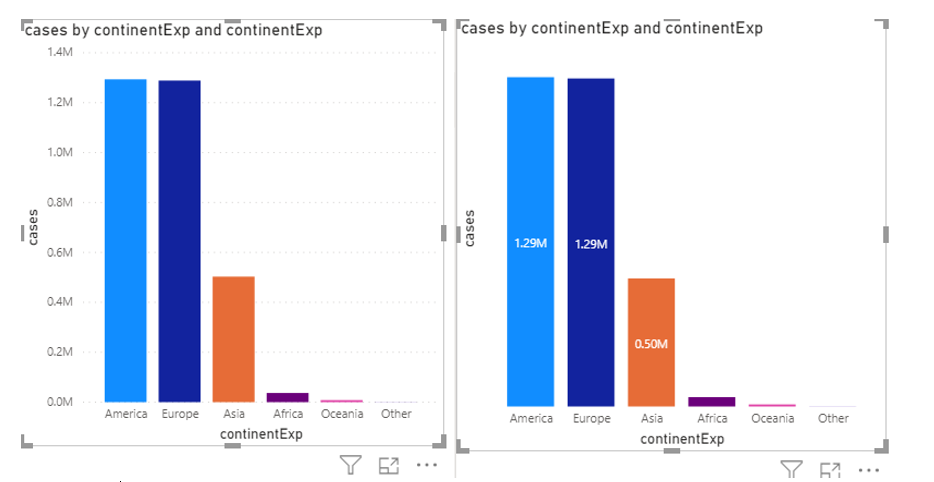
Assign the maximum space of the canvas to the visualization, try to avoid the axis labels and replace them with data labels wherever possible.
The left hand side graph can be re-designed to display Data Labels for better understanding using minimal space.
Alignment
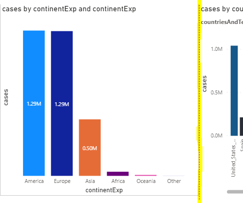
A proper aligned dashboard is not only visually appealing but also adds lots of weight to the dashboard. Make sure that each tile are properly aligned with each other (without poking up or drooping down). Looks simple, but makes a lot of impact.
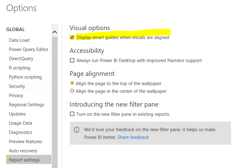
- Make use the Red Indicator bar line is Enabled. This would help you to align the tiles properly
How to Enable them >> File >> Options & Settings >> Options >> Report Settings
- Use of Arrow Keys
- Use the arrow keys to move the tile either left-Right-top-bottom by 1px
- Shift + Arrow Key helps to move 10 Px
- Shift+Ctrl+Arrow helps to overall increase or decrease the visualization
- Group Alignment
To have all the tile of equal Height and Width, here is what we can do .
- Hold the CTRL key and select all the tiles you need to align , then under format tab assign the desired the WIDTH / HEIGHT
- Copy Paste
- This is a very great option and indeed saves a lot of time in dashboard designing.
- Just apply all the formatting that you want to one card/tile and all you need to do is COPY+ PASTE the card and change the KPI or the Metric value .This helps to save time in formatting and keeps the overall dashboard formatting inline. Isn’t it cool?
BookMarks
This helps to Dynamically show or hide some objects\viz in your report. You can also compare it to kind of info window which we have in MicroStrategy.
Here is the excellent link below from Power BI to learn more about bookmarks
https://docs.microsoft.com/en-us/power-bi/create-reports/desktop-bookmarks
Built Custom Charts
This website helps to create a whole bunch of custom visualization that you want to create and use.
Link of the website to built: https://charts.powerbi.tips/
You Tube Link for learning : https://www.youtube.com/watch?v=2zgRVk38h6Q (How to built bar visualization .You will find tons of it in the site )
Be cautious as to ensure responsive design works fine with custom charts (as Mobile rendering might go off at times if not designed effectively)
Do share or comment below if any other tips that can be used as well ? would love to hear it from you all. Thanks!
Happy Learning!!