

Happy to share my Power BI dashboard using beverage consumption data provided by CDC .
Here are few of the best features in the dashboard that I have used
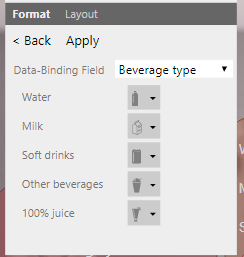
1) Used Infographic Designer 1.8.9 version : I must say this is one of my favorite visualization where you can really use different shapes in the Graph .
Here is the earlier post with detail step on how to import a new visualization in Power BI

The edit option would allow you to select among the varieties of shapes that Power BI has provided . If you want to be more creative , you can even download and use your own shapes .
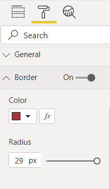
2) Have used rounded rectangle for all the visualizations to give it a card effect with an glossy look . Below is the property for enabling the rounded rectangle feature.
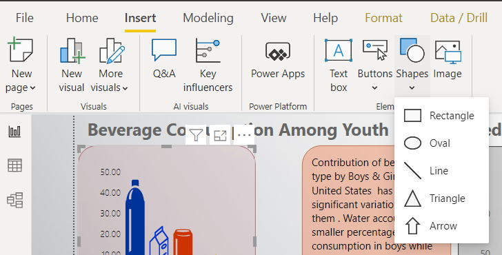
3) Power BI provides various shapes that can be used to design (also did little creativity by connecting line and circle to give a dumbbell effect)
4) Transparency Effect for Visuals\Text box\Any object

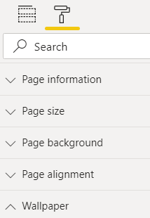
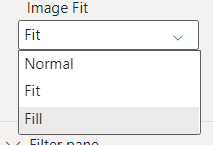
5) Image Fit Options -> Available in Page background and Wallpaper
Below is the Final Dashboard image which is designed

Data Source : https://www.cdc.gov/nchs/products/databriefs/db320.htm
Image Credit : https://www.elledecor.com/life-culture/food-drink/g9117560/aperitif-drinks/?slide=4
Superb design and explanation
Thank You Rohit