Glad to share yet another wonderful feature of Power BI visualization . Many a times we do use Map to showcase world or countries data values , however most of the times we do need to allot a good amount of the design canvas space to display the map neatly .
But with Power BI – Shape Maps things are made much easier with only using minimum space but yet allowing us to have number of other visualizations in the same workspace.
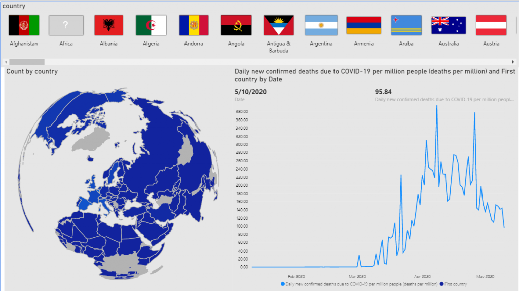
Also will share how to use World Flag Maps like the Card Widget we have in MicroStrategy.
Steps to Achieve World Flag Slicer & Shape Map
Creating World Flag Slicer
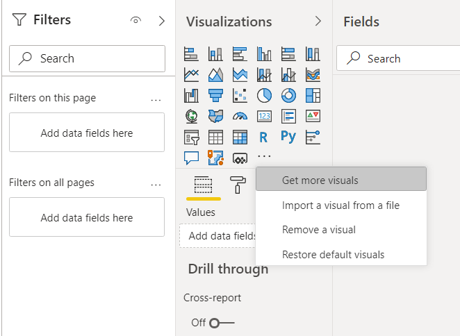
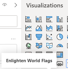
Step 1: First step is to import the custom visualization. Click on the dotted symbol and select “Get more visuals”.
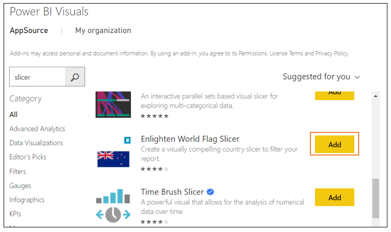
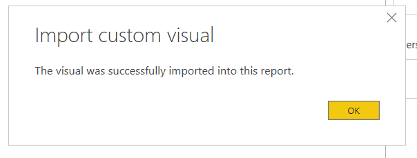
Step 2: Search for “Enlighten Word Flag Slicer” and select ADD. Once the visualization is loaded successfully you will be ready to use.
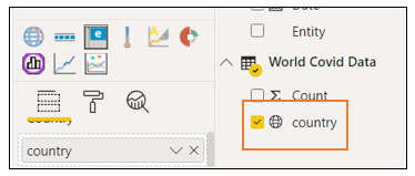
Step 3: Use the Country attribute as below to get the visual populated.
Creating Shape Maps
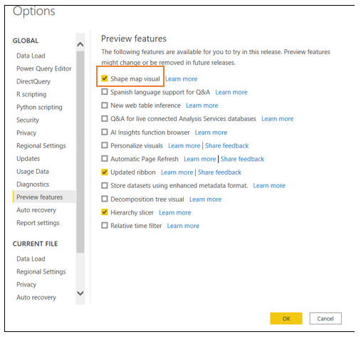
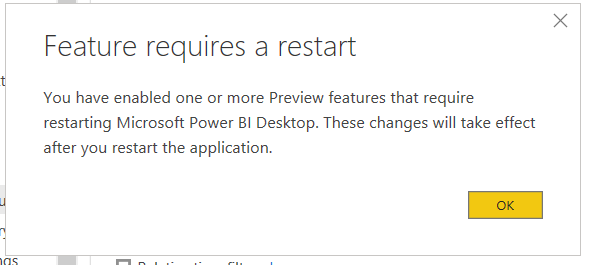
Step 1: The Shape Map visual is in Preview features, and must be enabled in Power BI Desktop. To enable Shape Map, select File > Options and Settings > Options > Preview Features, then select the Shape Map Visual checkbox. You’ll need to restart Power BI Desktop after you make the selection.
Step 2: The visual would be available for use , however this feature requires to restart the application.
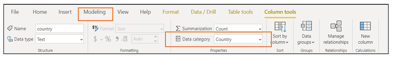
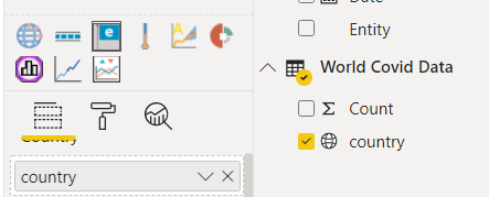
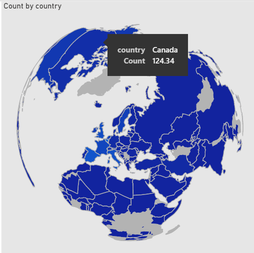
Step 3: A very important feature to have the shape map work effectively, is to have “Country – Data Category ” selected for the Country attribute . A small globe icon will get displayed next to it.
To specify a data category
- In Report View or Data View, in the Fields list, select the field you want to be sorted by a different categorization.
- On the ribbon, in the Properties area of the Modeling tab, select the drop-down arrow next to Data Category. This list shows the data categories you can choose for your column. Some selections might be disabled if they won’t work with the current data type of your column. For example, if a column is a date or time data type, Power BI Desktop won’t let you choose geographic data categories.
- Select the category you want.
- You can download it here
Step 4: Once Country is selected in Viz pane, Go To Format tab and import the World –Countries JSON File. This we need to import as we do not have pre-defined world map option in the drop-down.
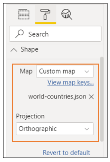
Step 5: Select “Orthographic” as projection .This gives the globe the desired spherical shape.
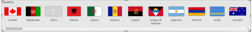
Step 5: Click on any “Country Flag “ to display the corresponding values in the map “ .
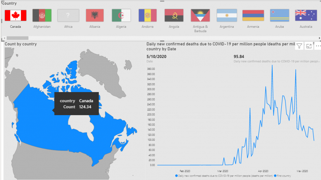
Step 6: De-Select the selected “Country Flag “to display the World Map as before.