

Let’s compare today different BI tools behavior of “Responsive Design” for dashboards
- MicroStrategy
- Power BI
- Tableau
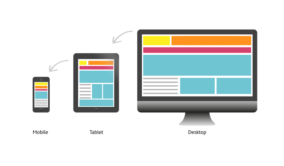
What is Responsive Design ?
Responsive web design is an approach to web design that makes web pages render well on a variety of devices and window or screen sizes
When it comes to business intelligence, we need to show our reports/datasets or collection of datasets in the form of dashboards/documents – so making that application be responsive on any given screen sizes is treat as responsive design (such as Web to Mobile or Web to Tablet should be seamless)
Here in this post, I’ll be comparing plain simple accessing the dashboard via browser majorly on Web , Mobile & Tablets
(& maybe little of Mobile Apps available by each BI tools)
Below are the validations performed on top of these configurations
- Web from Laptop
- Laptop 01 >> Lenovo ThinkPad – 14” (Resolution 01 : 100% , 1920 X 1080 , Resolution 02 : 125% , 1920 X 1080)
- Laptop 02 >> HP Elitebook – 15.6” (Resolution 01: 100%, 1920 X 1080, Resolution 02 : 125%, 1920 X 1080)
- Mobile
- iPhone XS
- Tablet
- iPad Pro (10.5 Inch)
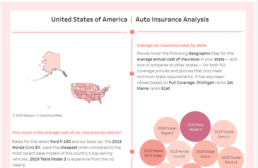
Dashboard Used are below for comparisons:
- Power BI
- MicroStrategy
Feel free to test these cases at your end if you would like too – open to hear your comments below!!
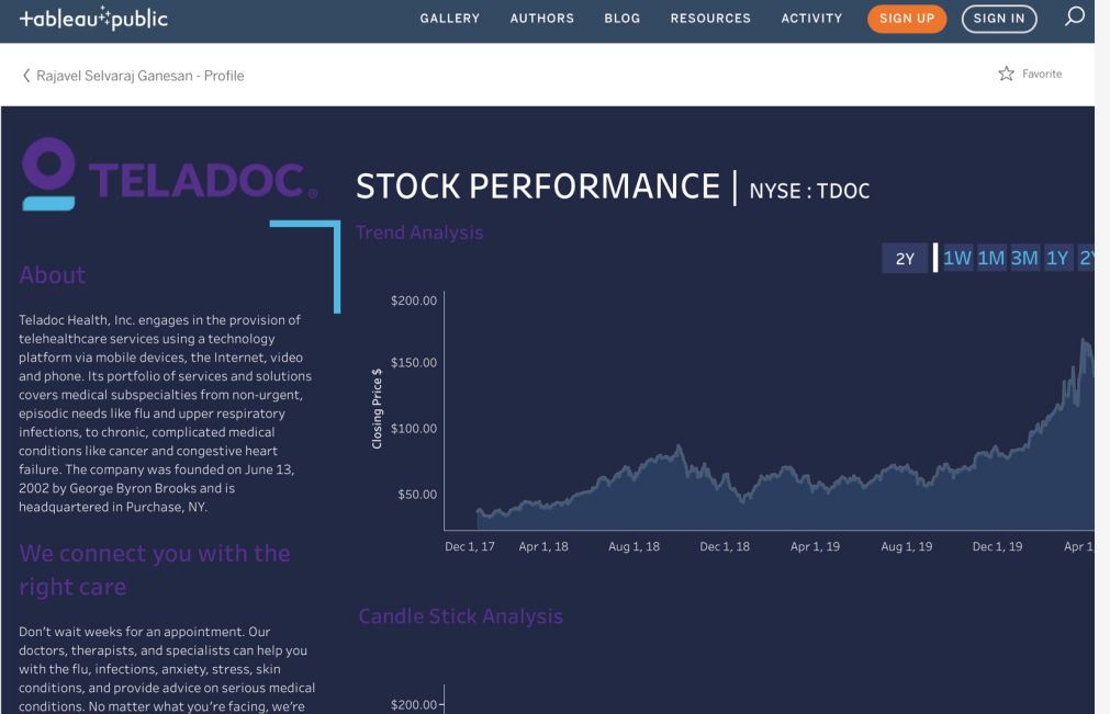
Tableau
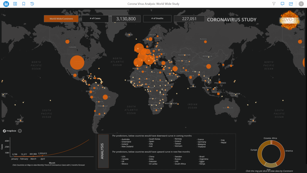
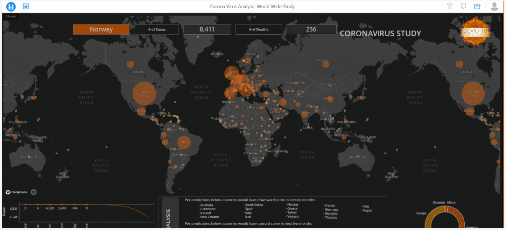
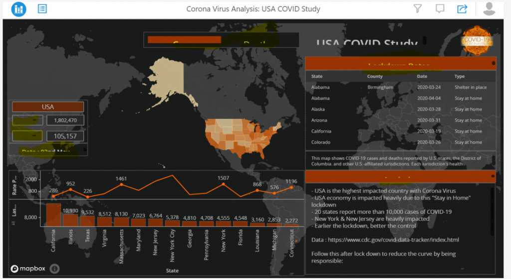
Web Access – Initial Focus
Laptop 01 >> Lenovo ThinkPad 14” >> 100% , 1920 X 1080 (Recommended)
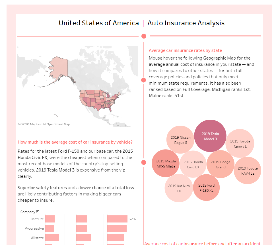
Laptop 02 >> HP Elite Book 15.6” >> 100% 1920 X 1080
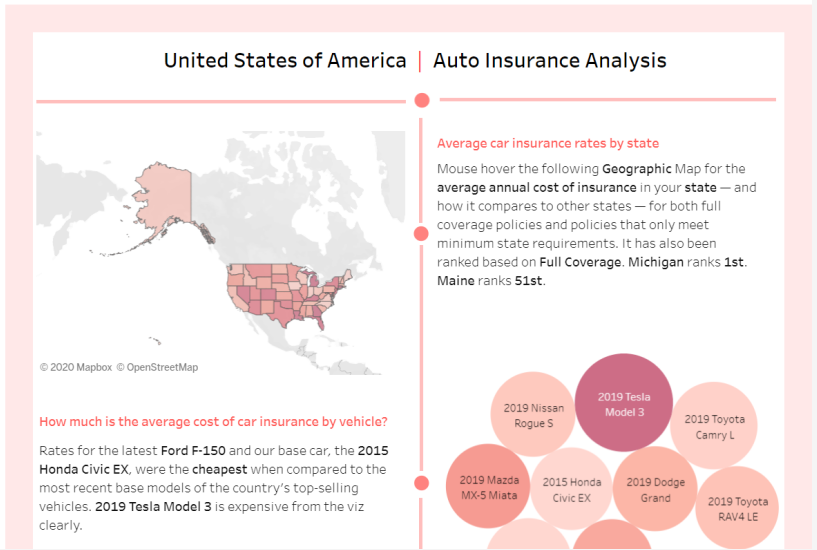
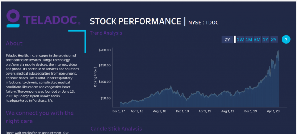
125% Screen Resolution looks seamless as 100% screen resolution type – Love Tableau
Mobile Access
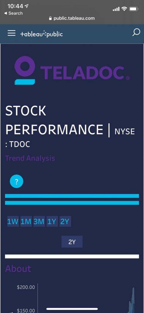
Can we fix them ? – Yes, Tableau provides an button to switch to “Desktop View” on mobile browser to view it as you see on Desktop.

Do you think – Is it worth ? Nah – I don’t think so – will lose your eyesight 🙂 Don’t ever think of keeping this approach. Maybe personal satisfaction to developer who built it will be happy using this feature, but executives (CXOs) will cry 😉 Better design them specific to view them on mobile apps or use containers to group and nicely view them responsive on varied devices or go for “Tablet” to view the dashboard (i.e.) iPad
iPad
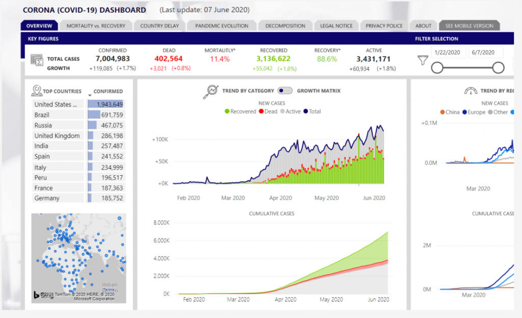
Power BI
Web Access – Initial Focus
Laptop 01 >> Lenovo ThinkPad 14” >> 100% , 1920 X 1080 (Recommended)
Laptop 02 >> HP Elite Book 15.6” >> 100% 1920 X 1080
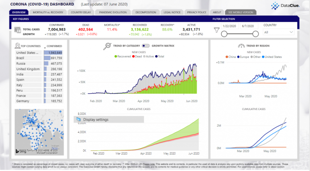
125% resolution looks good as well on Power BI – though it has lot of information cluttered in design
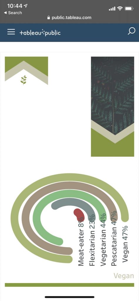
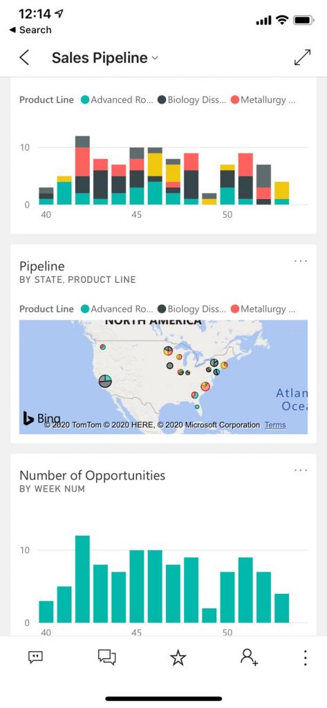
Mobile >> iPhone XS
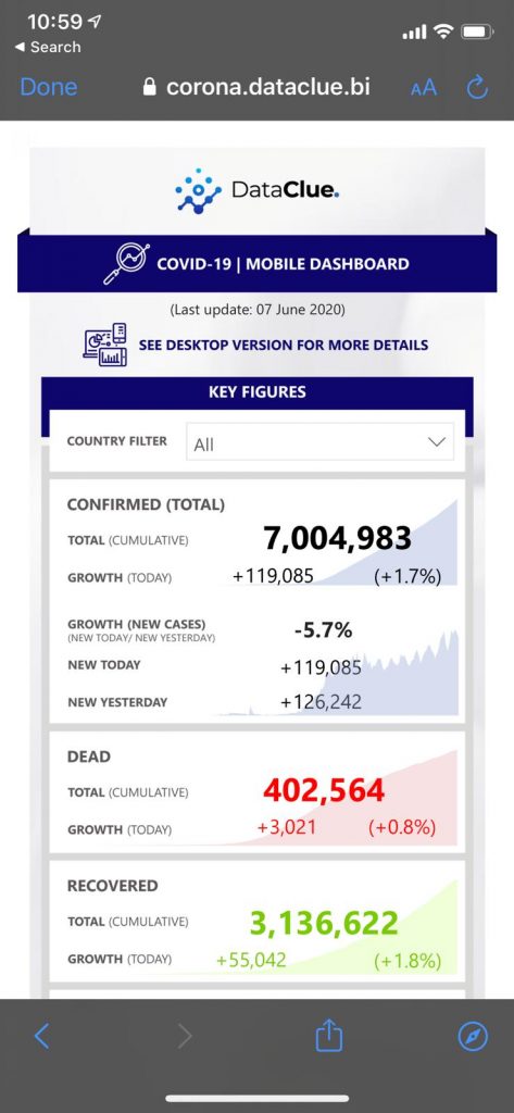
As above was designed to view for Mobile, i tested an dashboard that is responsive
Is it worth ? Same said earlier – not at all. How does it look on Mobile App ? let’s take a look below
MicroStrategy
Web Access – Initial Focus
Laptop 01 >> Lenovo ThinkPad 14” >> 100% , 1920 X 1080 (Recommended)
Laptop 02 >> HP Elite Book 15.6” >> 100% 1920 X 1080
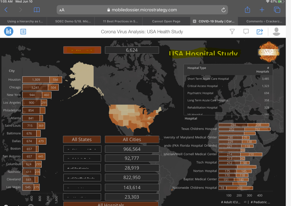
If laptop is set as 125% – it gets cropped or doesn’t render the responsive design properly (Requires improvement as a product)
Can we fix them ? YES – but requires some additional efforts to either re-design them to have lesser text box/visualization not being cluttered or keep the dashboard design simple or go for TILED design instead of FREEFORM Design
Reference: Best Practices for Free form Design Knowledge Article
My wish for MicroStrategy is to improve the product to be responsive on web interface with varied screen resolutions at least matching to other BI tools.
Mobile >> iPhone XS
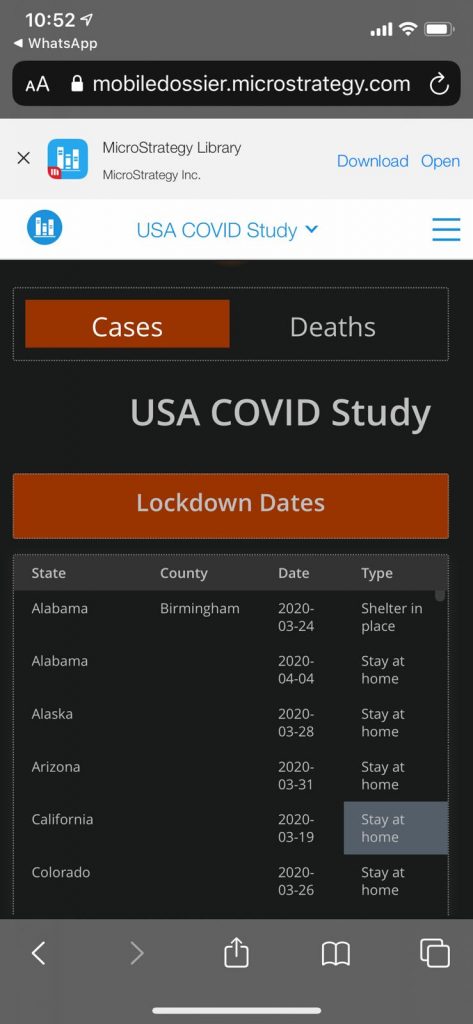
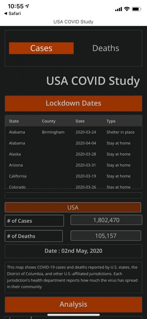
TIP: GROUPING plays better role in making responsive design effective & also with EXPORT on MicroStrategy being good
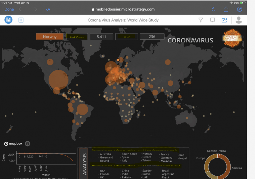
Tablet >> iPad Prod
Long Story Short :
- Be it any BI tool – Responsive Design will be helpful if accessed on Mobile Apps than on Browser
- Mobile Apps requires license & costs (so in those worst case comes with costing – you can go for browser based solution as temporary – but don’t keep it permanent – as tools are effective on their apps than on browsers)
- 125% Resolution on laptop/PC – Power BI, Tableau – looks great with responsive design, While MicroStrategy requires some improvements on product especially on Text Boxes
- My experience says – if you would like to develop an Mobile App that is of TRUE App feel – it can be done via MicroStrategy Mobile with Report Service Document – you can’t beat that RICH look and feel with modern responsive design. I understand, it involves IT effort to build them – but definitely worth for an ENTERPRISE solution implementation.
Enjoy Learning! Stay Safe & Health Guys!!