

Recently, i’m learning Tableau & thought to share my dashboard design experience which would help for any new designer to develop this dashboard. This can be applied to any BI Tool.
- Study or Understand the Data
- Have an design in mind or start wire framing (Pencil/Sketch – if interested)
- Have right viz to represent your data
- Provide insights about your data
- Color or theme to be consistent
- Here i was focused on the web users only (so no responsive in focus)
Study/Understand the Data
Tableau Community maintains this site very nicely and have data published every week. So you can download and start developing it with that.
URL : https://www.makeovermonday.co.uk/data/
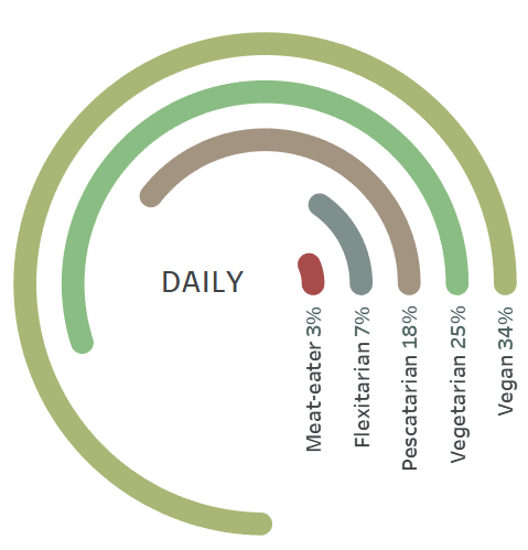
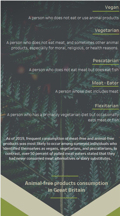
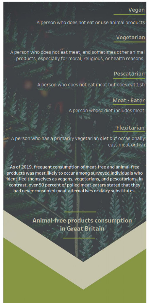
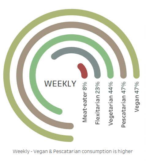
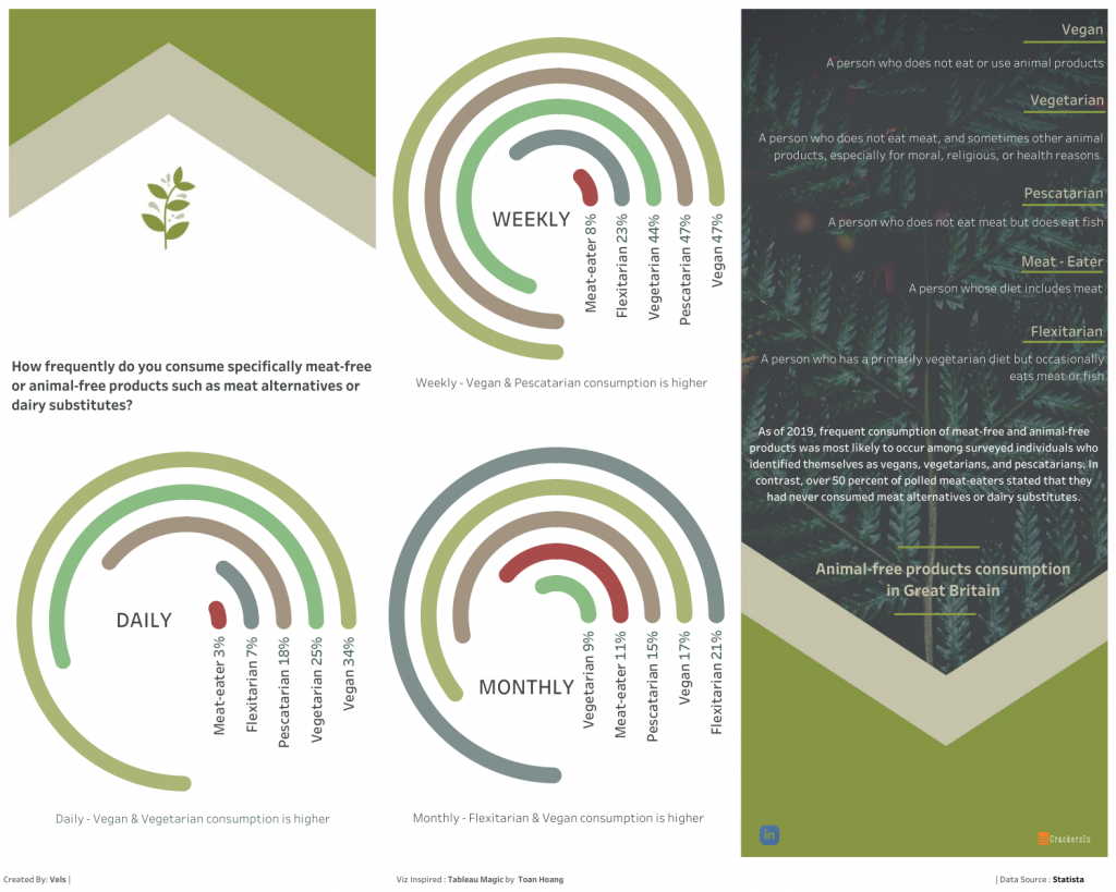
For this Week 23 of 2020, it was about Animal-free products consumption in Great Britain
I know, the concept is pretty easy to understand or know about Vegan, Vegetarian, Meat-eater, etc.,
Have an Design in Mind
I had to think of some better design to have my thoughts in mind to come into dashboard.

My idea is to explore “Radial Chart” – so i had that in my thought to use it within the above template of design.
Go for Adobe XD or Canva or Pencil Sketch to do it
Here i used Canva site to get above template and make use of it with my thoughts
URL : https://www.canva.com/
Have Right Viz
As i mentioned, my thoughts was to explore “Radial Chart” for long time and the data is tiny little (which fits for this design and analysis).
Thanks to Toan Hoang for this inspirational viz and having detailed steps to achieve it !
URL : https://tableaumagic.com/radial-bar-chart-tutorial/
Provide Insights about your data
Here i had to explain about some of the terms that are not known to all audience. Also describe about your analysis if possible. Make it easy for users to understand and analyze the data – so any proactive decisions can be taken!
Color or Theme to be consistent
If you notice closely, i try to follow the background image theme aligned to it. Texts and lines – fonts – making sure it aligns with theme.
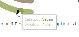
Viz as well should follow the theme – even tooltip
Tooltip as well not to be forgotten
Final Dashboard
Credit – mentioned on the dashboard & Source details as well – for easy reference to any layman person to understand..
Hope it helps for any dashboard beginners to understand the design process and development that goes out behind the scenes!
As this is simple excel – it was easy to do it. In real life or enterprise solution, will need to perform ETL/Data Modeling/Analyzing unstructured data/etc., plays. Hence, lot of parameters have to be considered or kept in mind.
Enjoy Learning!! Stay Safe & Healthy!!